Ever since my school days, I’ve been obsessed with unique, eye-catching fonts—though I’m no designer. My notebooks filled up not with study material but with elaborate custom lettering, and typefaces dreamed up during class. My English teacher archived one of my notebooks filled with font doodles as an amusing curiosity in 2005. These teenage creations tended toward the exaggerated and peculiar, with unconventional forms, strokes, and embellishments.
Now I know this style of elaborate, ornate, and somewhat distorted or exaggerated typography is known as “grotesque” or “grotesque sans-serif.” And while my font doodles were left in the margins of my school notebooks, as an adult, I indulge my fascination for grotesque fonts through curated collections that showcase the wide range of creative, expressive, and wonderfully weird letterforms in this style.

My fondness for grotesque fonts is about embracing the unconventional and ornamental. Grotesque fonts shun the simplicity and minimalism of many clean sans-serif fonts, instead drawing attention through creative twists on letter structure. Letters may have strokes that vary wildly in width or include curves and embellishments more typical of serif fonts. The effect in typography that is eye-catching, elaborate, and possesses a quirky sort of personality and visual flair.
While grotesque fonts are a broad category, some of my favorites distinguish themselves through extreme variations in stroke width or letters that seem in exaggerated conversation with each other. The structural simplicity of these sans-serif fonts is thoroughly disrupted to artistic effect.
Other grotesque fonts create a sense of flair through embellishment, with accents, curls, and ornamentation that give letters a gothic or art nouveau feel. The elaborate embellishment in these examples and other ornamental grotesque fonts allows for a lavish, eye-catching aesthetic appeal beyond the typical sans-serif.
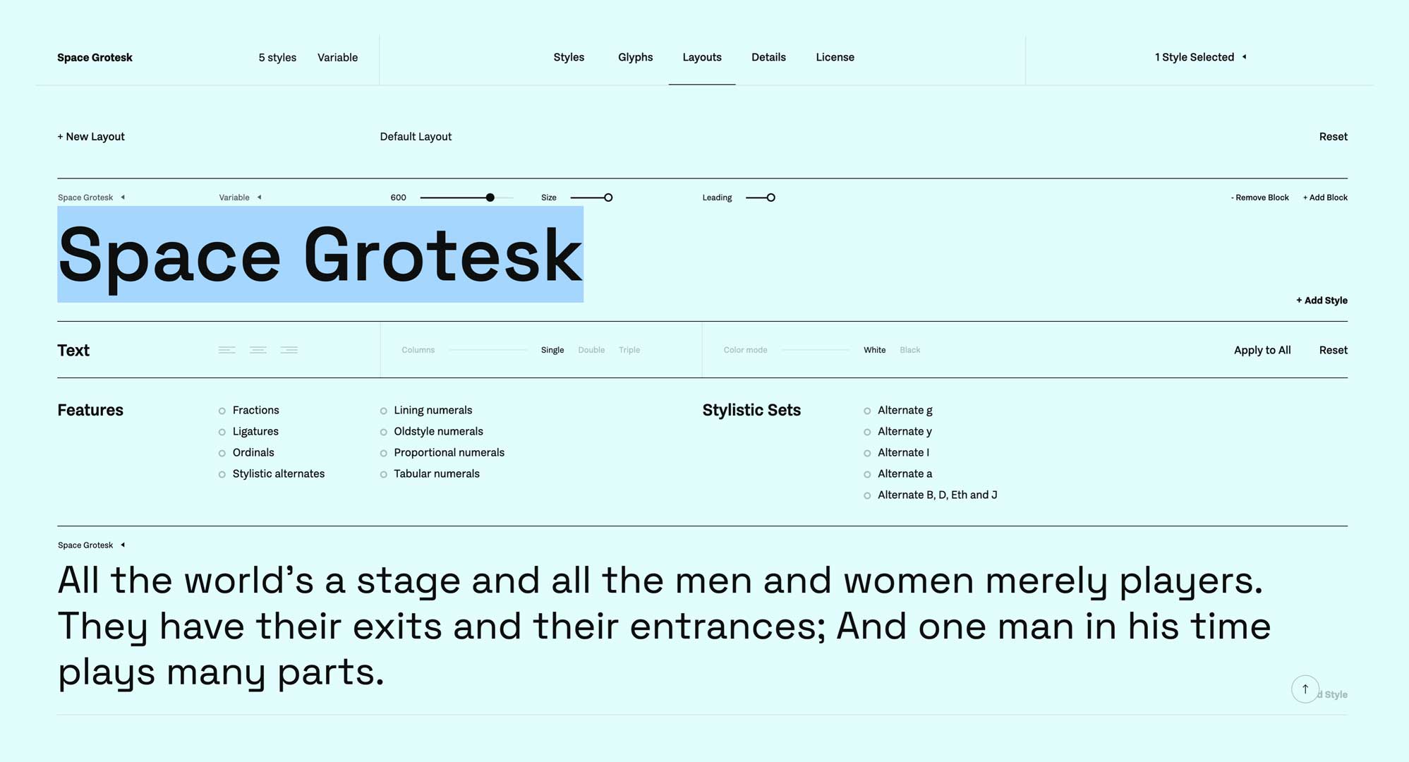
And when seeking grotesque fonts for personal use, I frequently browse the free collection at www.fontshare.com, hosted by the Indian Type Foundry.
My love for Georgia
While my heart belongs to the exaggerated flourishes of grotesque sans-serif fonts, I also appreciate the graceful simplicity of certain serif fonts. In particular, I’m fond of straightforward yet polished serif fonts like Georgia.
The Georgia typeface, created in 1993 (and released in 1996) by Matthew Carter, is legible even in small sizes on screens. It is a modern take on the “Scotch Roman” style of serif typefaces that originated in Scottish foundries in the early 1800s. With its solid structure yet subtle strokes and serifs, Georgia embodies Scotch Roman fonts' refined yet readable characteristics.
It has a simple, refined design with consistent stroke widths, a sturdy structure, and subtle serifs that give it an elegant touch suitable for headings and body text. This balance of minimalism and flair epitomizes why certain serif fonts appeal despite my penchant for the extravagant.
With serif fonts like Georgia, it’s about subtle precision and propriety instead of bold ornamentation. There is an attraction in the restraint and careful proportions of such fonts. While grotesque fonts draw attention and set a quirky tone, serif fonts like Georgia convey a sense of order, clarity, and formality that can be just as compelling in the right context.
An emphasis on legibility and propriety in typography is necessary for certain projects or designs. The allure of serif fonts like Georgia is that they deliver readability and polish while retaining a typographic identity and hint of style. While they may lack the brazen loopholes or embellishments of some grotesque fonts, a font like Georgia possesses its understated flair that can shine, especially when arranged artfully on the page.
My typographic tastes are diverse, ranging from the unrestrained novelty of peculiar grotesque fonts to the discreet composure of workmanlike serif fonts. There is room to appreciate both the extravagant and the minimal in font design. While my dedication will always tilt more to the weird and wonderful, serif fonts like graceful Georgia are in my font affections and uses. Across the spectrum of styles, it’s a personal typographic flair that one connects with—whether showy or subtle in form.